 ->
-> 
Am using PS CS2.
Lemme know if anything isn't clear. I tried to keep from babbling like I usually do and stick to "just the facts", so, of course now I'm worried I didn't include enough info. :p
Original photo here.
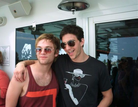
1. Crop. Duplicate > Screen 50%. Copy all layers and paste > Sharpen 60%.


2. New Fill Layer > Solid Color > #e5e5e9. Erase any color covering Van and Jake.


3. New Fill Layer > Solid Color > #401306. Set to Exclusion 100%.


4. New Fill Layer > Solid Color > #c6a1a1. Set to Soft Light 25%.


5. New Fill Layer > Solid Color > #a2cdc7. Set to Soft Light 15%.


6. Duplicate your finished base of V/J from Step #2. Drag it above the blue layer. Set to Multiply 40%.

7. Duplicate that Multiply base again. Set to Soft Light 20%.

8. Now I need a black and white version of the icon for the next layer. I do these steps in a separate base just cos it's easier/faster for me, but you can certainly do this within your present icon. I'm just weird.
8a. Copy all layers you have so far and paste to a new 100x100 box to get a new, merged layer.
8b. New Fill Layer > Solid Color > #000000. Set to Saturation 100%.


8c. Copy all layers and paste. Set to Screen 40%.

8d. Copy all layers and paste. Set to Overlay 35%.

09. Copy all your now b/w layers and paste back to your color icon. Set to Soft Light 85%.

10. New Adjustment Layer > Gradient Map > New Layer > OK.


10a. Set to Soft Light 50%.

11. New Adjustment Layer > Color Balance. Midtones: +18, -20, 36

12. Randomly decided I liked it flipped around better, heh. (Crtl + A to select all > Crtl + Shift + Copy then Paste to get a new, merged layer.)

13. Texture set to Multiply 52%.


14. Copy all layers and paste. Set to Multiply 32%.

15. New Fill Layer > Solid Color > d4fff8. Set to Color Burn 40%.


16. New Fill Layer > Solid Color > ffc0e0. Set to Soft Light 40%.


17. New Adjustment Layer > Selective Color
REDS: Cyan -80, Magenta +80, Yellow +80, Black +80
YELLOWS: Cyan -100, Magenta +40, Yellow +100
GREENS: Cyan -80, Magenta +80, Yellow +80, Black +80
CYANS: Cyan +100, Yellow -100
BLUES: Magenta +50, Yellow -100, Black +30
MAGENTAS: Cyan +40, Magenta +100, Yellow -100
WHITES: Black -50
NEUTRALS: Black +10
BLACKS: Black +20

18. New Adjustment Layer > Hue/Saturation > Saturation +20.

19. Texture by


20. New Fill Layer > Solid Color > #fde8ae. Set to Multiply 53%.


21. New Adjustment Layer > Hue/Saturation > Saturation -10
Ta-da!
*collapses*
6 comments | Leave a comment